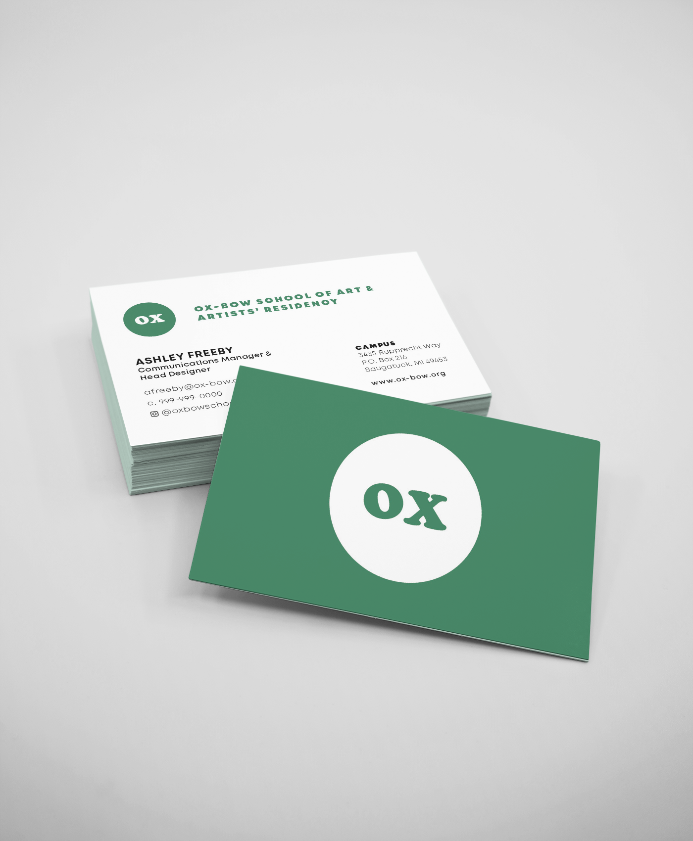
Ox-Bow’s Circle Logo
Design concept for new supplementary logo for Ox-Bow
“Over the course of last year you might have noticed some new things about our brand - use of gradients, a soft website redesign, less photos of our lagoon, and more bold colors (we still love our lagoon, though!). Without rebranding, our Head Designer, Ashley Freeby has been working to create a more cohesive design identity for Ox-Bow, and one of the elements she has developed is the OX-circle logo. Freeby extracted the "Ox" from our Ox-Bow name-mark in our signature font, Cooper Black. Enclosing it in a circle, Freeby thought about Ox-Bow's inclusiveness, community, and how every voice is welcome at our table. She says, "Ox is a place of tender moments that you carry on with you forever. It's a place to try and wander, connect, dance and do it all over again. It is a place of full-circles (if you will) - students become faculty, residents become visiting artists and in my case, teaching assistant become staff." That's where the OX-Circle came from - our continuous affection for the place we keep coming back too. Over the years "OX" has shown up on (literally) branded coasters, stickers and on other articles and communications; going forward, Freeby's new treatment embraces our nickname in a more uniform way. You'll see the Ox-Circle on our website, merch and print materials this year as an expansion of our classic brand, but don't worry, we are stillOx-Bow School of Art and Artists' Residency - you can just call us Ox (affectionately) for short. We hope you like it and we hope to sit around a campfire with you soon! XO, Ox.”
-written as a statement when releasing the new logo

